I am often shown results from some kind of trial or test performed in a market and asked if I think the results should be acted upon or not. And I always fall back to the same method I used to evaluate test results throughout my career whether looking at sometimes noisy aircraft design test data at Boeing, evaluating performance of a banner ad, or testing different places or times to ask customers to sign up for a newsletter. I have used the hypothesis testing equation to quantify some level of certainty that the winner is in fact a winner vs the result of noisy data and a skewed sample. I have found this to be such a reliable tool that I decided to make a google spreadsheet showing and applying the form of the equations that I used so anyone can see how I applied this practice. Feel free to make a copy of it for your own use if you want to, but please understand what it is and use it at your own risk.
TLDR: Go to this spreadsheet, copy it, change the values in the blue boxes and look at the resulting confidence intervals to see if a hypothetical test is done or not : )

I will tell you more about how I used it in this post, and I also plan to demonstrate its use at the Agile Marketing Meetup that I cohost with Austin Walne and Nick Muldoon on Wednesday, January 14, 2014, so you should be able to find the video of my demonstration on sfagilemarketing.com as well. Jascha Kaykas-Wolff is giving a talk about War Stories on Real World Agile Marketing right after the demo that should be excellent.
A/B Testing
Conceptually A/B testing is a simple concept, you show some group of your site visitors a red button (the champion) and another group sees the blue button (the challenger) and you see which one gets clicked more or has the higher conversion and/or takes the upsell more at checkout. You can change images, shopping cart flows, headline text, body text, virtually anything about the design. You do this instead of running the red for three days followed by the blue for three days because you can see that your baseline red button conversion rate is noisy and bouncing around all the time for who knows what reasons: marketing programs, press releases, day of week, end of month, dow up, dow down, etc. It is not uncommon for the noise in the data to be so great that you could get a 5-20% better solution and not even be able to see it among the noise. So you randomly present each version of the design to some portion of your traffic so that at least you can take the day to day variation in traffic types out of the equation and compare performance.
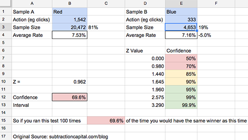
After running this test for a week, with the challenger blue button against 20% of your traffic, your conversion for the blue button is 7.16% vs 7.53% for the champion red button. 5% worse, so it is time to give up the test, right? Or is the sample size of the challenger conversions so small that if a few more conversions went one way or anther, it could catch up to even? The hypothesis testing equation gives you an objective framework to evaluate this. It also provides a methodology that you can use consistently across a team as well as over time to help avoid fooling yourself because you are not consistently evaluating your product. In my experience, this is even more important than the accuracy of the methodology at chaotic fast growing tech companies.
The first times I saw the Hypothesis Testing Equations Applied
In about 1994, I was in the Advanced Technology and Design Aerodynamics group at Boeing, and two PhD Aerodynamicists, Byram Bays-Muchmore and Frank Payne, were showing me some noisy aircraft design data that had 90% confidence interval bands drawn around the data based on measurement. And although one curve was clearly higher than the other curve, the bands for the two designs overlapped more than not, so I couldn’t be very certain that one design was actually better than another. And the hypothesis testing equation suggested the likelihood that if all noise and granularity was removed from the data the winner would actually still be the winner. This was probably the first time that I had seen practical application of uncertainty around real data. We didn’t do this in college!
Fast forward 5 years, and I had moved over to the new and exciting world of the internet as a product guy. Imagine my surprise when I saw the Marketing team at NextCard using an Excel spreadsheet that Jared Young had built to apply the hypothesis testing equation and calculate the likelihood that one banner was actually performing better than another or not.
They were using the binomial form of the equation to look at click through rate and account application rates for different banners. Dave Schwartz, the brilliant quantitative marketer who hired me at Coupons.com and has founded his own marketing analytics company Cold Creek Technology, even made a mantra out of creating three segments for a test. He called them A, A’ (A prime), and B. A and A’ had the same designs and only differed by their group label. So essentially, they were a randomization check. The hypothesis testing equation should always tell you that A and A’ were statistically identical if not numerically, and if they didn’t there may be a bias to the way you assigned your population. This is a step up in the level of sophistication though.
So when we built the A/B testing engine in the product, it was very natural at NextCard for us to use the hypothesis testing equation to evaluate results. Since we were trying to test participation and results of customers for the life of the customer, we could even apply the continuous versions of the equation set to look at profitability of two different groups over time, etc.
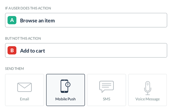
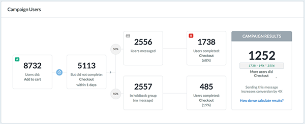
I continued to use the hypothesis testing equation at Advanta, Washington Mutual, and Coupons.com as we built our A/B testing engines and evaluated results. Later Google Website Optimizer used it as well, and so did Visual Website Optimizer and Optimizely. I am sure Outbound.io will use it to evaluate messaging data as well. It is a structured and convenient form and less subjective than just looking at means from different sample sizes or variances. Thankfully others won’t have to build A/B testing engines any more as they are available off the shelf and they apply best practices like this typically, but interestingly, I don’t think the ad servers have built a really convenient hypothesis testing evaluation into their tools as of the time of this writing (hint!). And I don’t think people have done a good job applying these tools for scenario analysis for test planning or segmentation analysis yet either. I will elaborate more later.
My Derivation

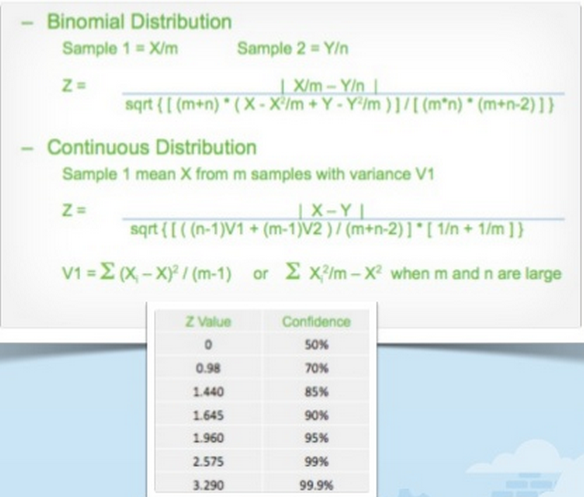
My derivation was motivated to get a form that was easy to code in SQL, as that was the tool that I was most often using for analytics. So this form was derived once at NextCard back when and I shared the result of that derivation in my Agile Marketing Meetup talk on page 13. It was re-derived to check accuracy at Coupons.com many years later after I found out that in addition to being an incredible analytical marketer, Jiyoon Chung was also an amazing statistical whiz. She started it off from first principles again and she also checked my derivation at the end to make sure I didn’t mess it up. But that and a couple conversations with other stats whiz’s that I have worked with is the extent of my diligence. There are other forms of the equations as well as other ways to do this, but I have always used these forms because they are easy in both SQL and Excel, and now in Google Spreadsheets as well.
The Equations and the Spreadsheet
Look at my google spreadsheet as I am going to use it as a concrete example for the remainder. The screenshot of it above can also serve as a reference. There are two forms of the equation for two types of data, and two tabs in my worksheet accordingly. One for what is called a binomial data distribution, which means there are only two possible outcomes. So a visitor clicked or didn’t, converted or didn’t, signed up or didn’t, yes/no answers, thus binomial. Mathematically, if you know the mean % conversions of a binomial distribution, you know what the variance looks like as you know exactly how many converted and how many didn’t. So it is a little bit simpler to look at.
The other tab, for a continuous distribution, is typically used for things like shopping cart size, 12 month cumulative revenue, or number of friends referred. You need a variance number for this one, but that is appropriate for these types of measures.
What does it mean, a non-statistician’s interpretation of what smart people have explained to me
With apologies to real statistics people that may bury me in the comments, here is a lay person interpretation of how to use this. If you run a test against a discrete population of limited sample size, you are getting an estimate of what conversion would be like if you ran it against the whole population. This is what you want to do, so you can find the best converting approach to run against the entire market before you spend the big bucks to get in front of the entire market. But depending on how large a sample you run, if you ran the same test against another small sample you might get a little different number for a variety of reasons. So in the spreadsheet, put in a sample size and conversion number for sample A and B, and the confidence interval will tell you the % likelihood that the current winner is the real winner against the total population. It doesn’t say how much it would win by, just that it would be the same winner. So if it is 50%, you have two numbers that are statistically the same. A quarter lands on heads 50% of the time after all. At 90% confidence, there is still a 10% chance the other is the “real winner”. This is a simplification, but a working one. The actual description as I understand has to do with the distribution of relative sample results. Talk to a statistics person rather than an operator if you want to go there : )
In my example spreadsheet I ran the test in front of more than 25k visitors and got more than 1,800 conversions. And my red page converted 5% higher than the blue page. Sounds pretty solid right? But with only 70% confidence red is really better, it is not too much better than a coin toss as to which page would really win against the whole population. Sometimes, I might keep the test running. Sometimes, I might call this a draw and move on to try to find something that wins by more than 5% performance. But regardless, I know something about the test results that does not necessarily look intuitive at first glance. And of course, just knowing red vs blue did not move the dial enough to get to a 10% performance delta, which would have yielded a 95% confidence interval, is useful data regarding how a sample of my market interacts with my product experience. 95% is what I often looked for to declare a winner, though I might move forward with as low as 85%, but knowingly so.
Practical Application
My goal of A/B testing is not only to find the winner and apply it, but more importantly to learn about my product and market and apply that learning to win. If I was simply trying to get the highest number, a machine could optimize things for me potentially, but no market is large enough to test all the variations possible and find a winner, so I am trying to learn and inform the variations I would like to prioritize. As far as numerical confidence, I did like to get 95% if possible, and I started to favor a result around 85% and might even consider declaring a winner and a discriminant at that level.
Segmentation
One way I like to learn about markets is to segment results of A/B testing in analysis. In many cases, I might have a tie for the red and the blue page at the aggregate level, but find that one segment performed significantly better and one significantly worse, resulting in a draw at the aggregate level. But that means that I had to apply these methods to each segmentation dimension to ensure I had significant results within the segments, otherwise it may just be noise at that level too. Anyway, if I found that one segment performed better with version A and the other with B and the differences in performance is statistically meaningful, you might first think that I would run two versions of my product experience depending on which segment I was running against. But this is not a very scalable approach and I almost never did it. If I had, I would have created more and more permutations of product experience and it would get really difficult to manage and maintain. Better to understand why each segment is performing better or worse, and then take that learning to run a new test with version C and try to get the best performance out of both segments.
Test Weights
The prior example brings up an important use case of the worksheet. I used it to figure out how much audience I want to throw at a test. There are many considerations when sizing a test. If it is a change I am definitely making for brand or product reasons, I may just want to measure the performance impact relative to the old baseline. So I might run it 50/50, 50% of your audience getting version A and 50% getting version B, so that you converge on a number as fast as possible. Often places I worked converted very differently on weekdays vs weekends, so I wanted to run tests for a week if possible and have statistical significance if I segmented by weekday/weekend or even day of week. Sometimes I was testing something I thought would hurt performance but where I would learn something valuable enough to make up for it in the near term. Regardless of which scenario I wanted to try out, I could put estimates of the sample sizes I thought I would see into the spreadsheet and figure out what the smallest change that I could get 95% confidence on would be. Or I could look at the smallest measurable difference I would get out of throwing a full blown 50/50 test in. Or if it was realistic for me to measure a segmentation result. I could have re-derived equations to calculate these things precisely or used goal seek to iterate the answer, but in practice I just threw numbers in to get a feel for it.
There are a bunch of other handy and fun uses. Part of the beauty of a tool like this is that it is pretty flexible. And even the Optimizely’s of the world don’t have the sort of scenario exploration or segmentation analysis built into their product yet, so it can be handy to keep around. The other thing I did was keep a copy of this spreadsheet with the results of every test run in a binder along with cohort graphs when applicable and hard copies of the design for A and B. I found this historical reference was really useful to share with teammates and reference. I know, a paper archive seems very dinosaur now, but maybe that is what I learned back at Boeing with the likes of test documentation and flight test manuals. Regardless, I found a spreadsheet like this to be a very handy tool, and I hope that it might benefit a bunch of people to see under the hood. Please hit the comments up with your stories of methodologies and use cases, and please forgive my statistical glossing over as well as incomplete descriptions of everything. This could easily be a one hour talk rather than a two page blog post. And finally please credit Subtraction Capital if this helps you out. We are always grateful for good credit among entrepreneurs.

